The 2-Second Decision That Changed Everything
My deep dive into Netflix's $30 billion thumbnail strategy and what it means for your business
Three years ago, I thought thumbnails were just pretty pictures.
Quick visuals to grab attention. Something the design team handled after the real product work was done. A small detail in the bigger strategy.
I was completely wrong.
Last year, I was working on improving thumbnails for my YouTube channel when I noticed something frustrating in our metrics. People were spending ages browsing but barely engaging with our content.
That's when I started obsessing over how Netflix approaches thumbnails.
What I found completely changed how I think about visual decision-making.
The Reality That Hit Me Hard
You make viewing decisions in just 2 seconds.
Netflix turned those 2 seconds into millions in additional revenue.
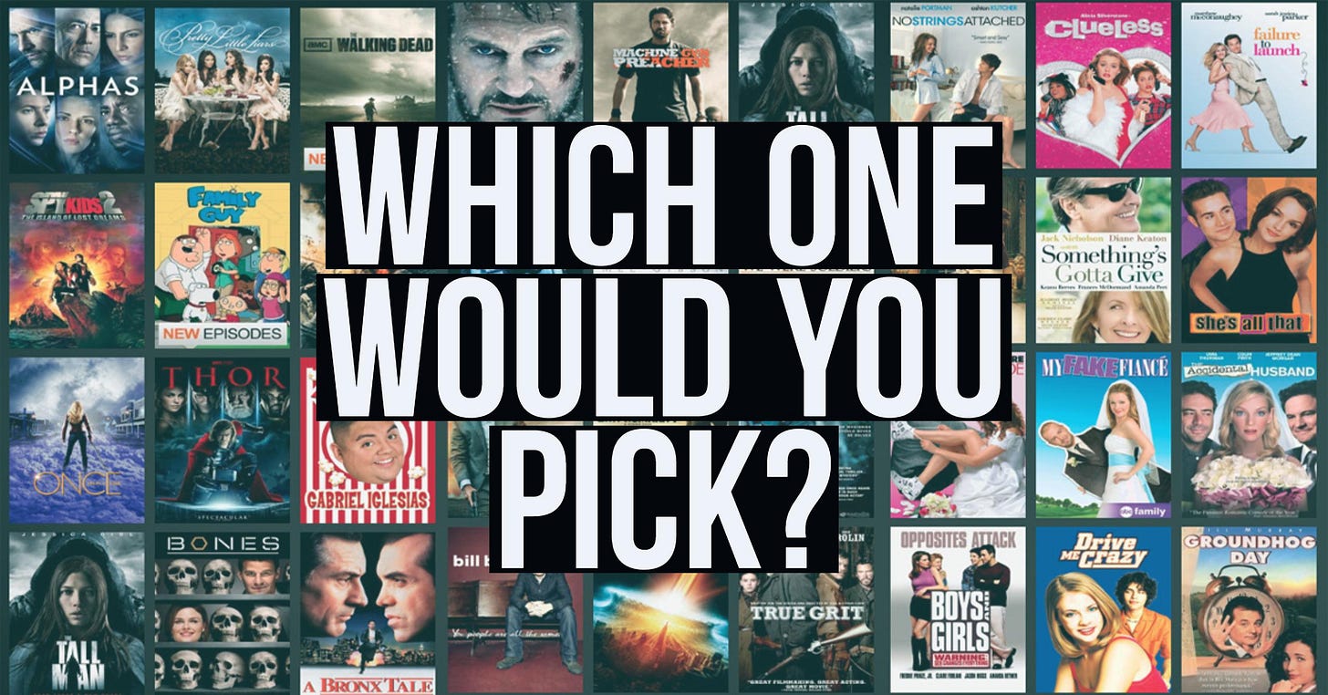
Think about your last Netflix session. You probably scrolled through dozens of options, pausing briefly on some thumbnails, completely ignoring others. What made you stop? What made you click?
Netflix knows exactly what made you click.
And they engineered that moment.
The Strategy Nobody Talks About
Here's what I discovered when I dug deeper into Netflix's personalization engine:
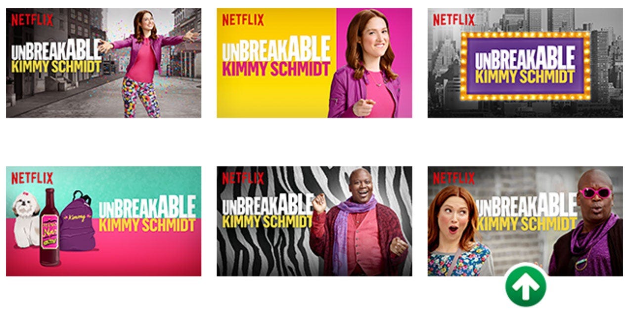
Most streaming platforms show everyone the same movie poster. Netflix shows you 6-12 different versions of the same thumbnail and picks the one designed specifically for YOUR viewing psychology.
Let me prove this to you.
I tested this myself last month. Logged into my Netflix account, then my partner's. Same show, completely different thumbnails.
Mine showed the romantic subplot (I love character-driven stories). His showed the lead actor in action (he binges crime dramas).
Same content. Completely different first impressions.
The Three Pillars of Netflix's Visual Strategy
Pillar 1: They Know You Better Than You Know Yourself
Netflix isn't guessing what you'll click. They're studying your behavior obsessively:
Every show you watch, pause, or skip
Which actors make you stop scrolling
What emotions hook you most effectively
Even how long you hover over different images
This isn't just data collection. It's systematic psychology at scale.
Pillar 2: They Test Everything
While other streaming services were having design debates, Netflix was running hundreds of thumbnail experiments:
Testing multiple images for every single show
Measuring which visuals actually stop your scroll
Analyzing exactly which thumbnails drive the most plays
That thumbnail that made YOU click? It won a competition against dozens of alternatives.
The testing process is ruthless: Every thumbnail fights hundreds of others in A/B tests. The winner gets shown to millions. The losers disappear forever.
Pillar 3: Personalization at Individual Level
Your Netflix homepage doesn't look like anyone else's:
Love romance? They show you the kiss scene
Love action? They highlight the explosion
Love a specific actor? They put that person front and center
Same show, completely different thumbnail, based on what makes YOU personally click.
The Numbers That Matter
Netflix saw up to 30% increases in engagement when they ran experiments just from optimized thumbnails.
That's not just better user experience; that's direct revenue impact.
Think about what a 30% engagement lift means for a platform with Netflix's scale. We're talking about hundreds of millions in additional subscription value, just from getting the first visual impression right.
What This Means for Your Business
Here's my biggest learning: Most companies obsess over the product after people engage. Netflix mastered getting people to engage in the first place.
Netflix doesn't sell shows anymore. They sell the click.
Every thumbnail is a tiny sales page optimized for one person's psychology.
The Framework You Can Steal
Whether you're building an app, running ads, or designing email campaigns, here are the lessons from Netflix's playbook:
1. Know Your Micro-Moments
Netflix optimized for the 2-second decision window. What's your customer's equivalent split-second choice?
For e-commerce: The product image someone sees in search results For SaaS: The hero image on your landing page
For content: Your email subject line and preview text For apps: Your app store screenshots
2. Test Your Visuals Religiously
Most companies test copy extensively but treat images as afterthoughts. Netflix proves visuals can drive 30% conversion lifts.
Action step: Pick your most important visual touchpoint. Create 3-5 versions. Test them against each other. Measure actual engagement, not just aesthetic appeal.
3. Personalize the First Impression
Your homepage, email headers, ad creative-are you showing the same thing to everyone or customizing for different audience segments?
Start simple: If you know someone came from a specific source or showed interest in a particular feature, show them visuals that reflect that interest.
The Psychology Behind the Strategy
What Netflix understands about visual decision-making:
People don't read first, they feel first.
Before you process what a show is about, you're already forming an emotional reaction to the thumbnail. Netflix optimizes for that emotional trigger.
Context shapes preference.
The same person who clicks on action heroes during weekend browsing might prefer romantic comedies on a Tuesday night. Netflix tracks these patterns and adapts.
Familiarity drives engagement.
If you love a particular actor, seeing their face in a thumbnail creates instant connection. Netflix uses this psychological shortcut relentlessly.
What I'm Applying Now
Since studying Netflix's approach, I help teams think about every visual touchpoint as a conversion opportunity.
Questions I ask before launching every campaign:
What's the first visual impression the customers get?
Are we testing different versions of our key images?
Do you know which visual elements actually drive engagement?
Your product might be amazing, but if people don't click, they'll never know.
The Uncomfortable Truth
With attention spans getting shorter every year, those first 2 seconds of visual decision-making have become the most valuable real estate in business.
Most companies are wasting this opportunity.
They're using generic stock photos, one-size-fits-all visuals, and hoping good content will overcome poor first impressions.
Netflix proved that's backwards. Get the first impression right, and engagement follows.
The Question for You
Here's what I want to know:
What's one visual element in your business that you could optimize to drive more engagement?
Maybe it's your product photos. Maybe it's your social media posts. Maybe it's the images in your email campaigns.
Pick one. Test it. Measure what actually drives clicks, not what looks "good" in meetings.
Because Netflix didn't build a $30 billion business by guessing what looks nice.
They built it by knowing exactly what makes you click.
P.S. I'm curious about other examples of companies that have mastered visual psychology. Have you noticed any brands that seem to always grab your attention with their imagery? Hit reply and let me know-I love analyzing these strategies.
Next week:
This newsletter is my space for real, field-tested insights from India's consumer market. No jargon. No fluff. Just what's actually working.
If this changed how you think about visuals, forward it to someone who designs customer touchpoints. And if someone forwarded this to you—subscribe here for insights like this every week.
Source : https://vulcanpost.com/576870/thumbnails-grab-attention-netflix-answer/
https://www.independent.co.uk/tech/netflix-thumbnails-ab-testing-pictures-experiments-design-watch-a7012966.html


Netflix really has mastered the way to grab attention in a very short attention span with its visuals. I must say, I have personally fallen for this a lot of times haha 😄
About your question, one company that immediately came to my mind was Blinkit. They always have such...nostalgic packaging filled with stories that I can't seem to throw those bags away. And keeping those bags around also increases the brand recall, making me remember blinkit and prefer it over other competitors.